The Mistery of the Changing Width
October 16, 2021

Photo Credit: Sereja Ris
I'm quite new at frontend development, never done more than a couple of personal tools, one of them in pure HTML generated by JSPs and other using Angular 5/6 that was published inside a Sharepoint site.
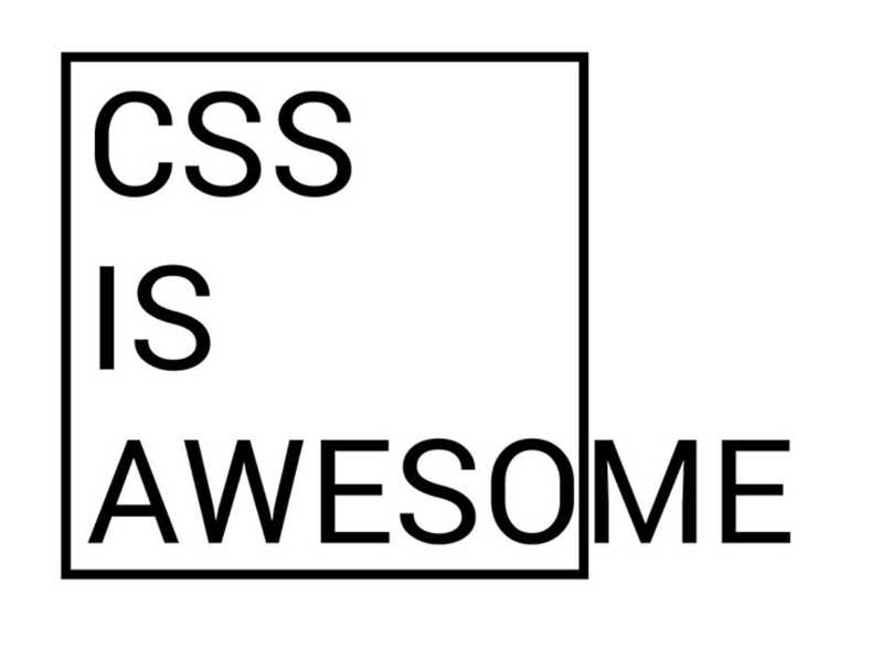
Despite this lack of experience, I'm familiar with the "CSS is awesome" meme:

Source: CSS Tricks
And it was a matter of time that I had the first CSS mistery in this blog.
I realised that while browsing this blog, when I entered the Hello World the position of the title and the links was slightly different than the rest of the pages (About and Blog). Using the developer tools I realised that, although the main div had the 800px size I had defined, the total width of the page changed, changing the center of the page in the process and moving the whole page left or right.
It has taken me a couple of days of entering and exiting the page to realize that the problem was originated by the scroll bar! If the page was long enough to need a scroll bar, then the width of the scrollbar changed the width of the page. That also explained why in mobile it didn´t happen, because mobile browsers do not show a scrollbar.
Knowing the problem, a quick Google search showed several solutions. The one I chose
was applying this css style to the <html> node:
html {overflow-y: scroll;}
This makes the browser take into account the size of the scrollbar even if it is not needed in the page, so now all the pages have the content correctly centered. You can see the whole commit here.
Previous: Hello World!Next: Kibana Enhanced Tables